Control Chart
What is it?
✓ A control chart, invented by Walter A. Shewart, is the most widely used tool in statistical process control (SPC).
✓ The control chart is a graph that displays data taken over time and the variations of this data.
✓ The control chart can be used to check whether the process is being controlled statistically.
✓A histogram gives a static picture of process variability, whereas a control chart illustrates the dynamic performance (i.e., performance over time) of the process.
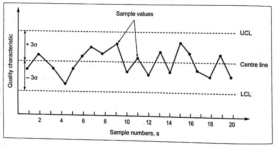
✓ The control chart is based on a series of random samples taken at regular intervals. The general form of the control chart is shown in Fig.1.

Fig.1. Control chart
✓ The chart consists of three horizontal lines that remain constant over time: a center, a lower control limit (LCL), and an upper control limit (UCL). The center is usually set at the normal design value. The UCL and LCL are generally set at ±3 standard deviations of the sample means.
✓ If a sample drawn from the process lies inside these (UCL and LCL) limits, it means the process is in control. On the other hand, if the sample lies outside these limits, then the process is said to be out of control. So appropriate corrective action is necessary to eliminate the condition.
Types of Control Charts
The two categories of control charts are:
-
Control charts for variables – for measurable data such as time, length, temperature, weight, pressure, etc.
-
Control charts for characteristics – for quantifiable data such as number of defects, typing errors in a report, etc.
When do we use it?
✓ The purpose of a control chart is to identify when the process has gone out of statistical control, thus signaling the need for some corrective action to be taken.
✓ It is used to show the sources of variations and to eliminate them in order to statistically control the process.
✓ It is also used to evaluate process stability and to decide when to adjust the process.


