Scatter Diagram
What is it?
✔ The scatter diagram is a simple graphical device to depict the relationship between two variables. It is the graphical component of regression analysis.
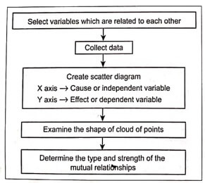
✔ A scatter diagram is composed of a horizontal axis containing the measured values of one variable (independent, i.e., cause) and a vertical axis, representing the measurements of the variable (dependent, i.e., effect).
✔ This diagram displays the paired data as a cloud of points. The density and direction of the cloud indicate how the two variables influence each other.
✔Although this diagram cannot prove that one variable causes the other, but they do indicate the existence of a relationship as well as the strength of that relationship.
✔ These diagrams often used as follow-ups to a cause and effect analysis to determine whether a stated cause truly has impact on the quality characteristics.
Types of Scatter Diagram Patterns
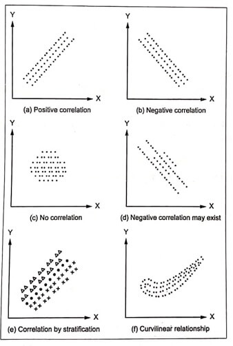
The possible patterns i.e., shapes of clouds are depicted in Fig.1 (a) to (f).

Fig.1. Possible patterns in scatter diagram (Cause – x -axis; Effect – y -axis)
✔ Interpreting the direction: Data patterns may be positive, negative, or display no relationship.
- A cluster of points that slopes upward indicates a positive relationship (refer Fig.1(a)). That means an increase in the cause variable also increases the effect variable.
- A cluster of points that slopes downward indicates a negative relationship (refer Fig.1(b)). This indicates that an increase in the cause variable results in a decrease in the effect variable.
- When it is difficult or impossible to determine the trend, it indicates that there is no relationship between the two variables (refer Fig.1(c)).
✔ Interpreting the strength: Data patterns should also be interpreted for strength by examining the ‘tightness’ of the clustered points. The more the points are clustered to look like a straight line, the stronger is the relationship.
When do we use it?
✔ The purpose of the scatter diagram is to display what happens to one variable when another variable is changed.
✔ This diagram is used to understand, why particular variations occur and how they can be controlled.
How do we construct it?
The sequence of steps used to construct the scatter diagram is outlined in Fig.2.

Fig. 2. Construction of a scatter diagram
Illustrations
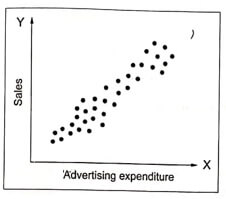
Example .1 An organisation investigates the relationship between the advertising expenditure and its product sales. The scatter plot can be drawn between the advertising expenditure and the company sales as shown in Fig.3. Fig. 3 indicates a strong positive relationship between the variables; thus the company sale tend to increase with the increase in the level of advertising expenditure.

Fig. 3. Scatter plot of advertising expenditure Vs. sales
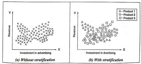
Example . 2 Fig.4. shows the scatter diagram relationship between advertising investment and revenue generated for three products of company.
✔ Fig.4 (a) shows the scatter diagram without stratification in which all the data are plotted and it appears to be no correlation.
✔ Fig.4 (b) shows the scatter diagram with stratification, in which the data are stratified according to product and a correction is seen to exist. Product 1 has negative correction and products 2 and 3 have positive correlations.

Fig. 4 Scatter diagrams of investment in advertising Vs. revenue


