Pareto Diagram
What is it?
✔ A Pareto diagram is a diagnostic tool commonly used for separating the vital few causes that account for a dominant share of quality loss.
✔ This tool is named after Wilfredo Pareto, the Italian economist, who devised this tool first. This tool is used to single out the ‘vital few’ from the ‘trivial many’.
✔ The Pareto diagram is based on the Pareto principle, which states that a few of the defects accounts for most of the effects.
✔ Pareto analysis is also called as 80/20 rule and ABC analysis. It means only 20% of problems (defects) account for 80% of the effects.
✔ This analysis is a method of classifying items, events or activities according to their relative importance.
When do we use it?
✔ Pareto analysis can be used in a wide range of situations where one need to prioritise problems based on its relative importance.
✔ It can be used as a risk assessment technique from activity level to system level.
How can we construct it?
A Pareto diagram can be constructed using the following steps:
- Obtain data, using a check sheet or brainstorm.
- Arrange the data in descending order starting from the largest category to smallest.
- Calculate the total and percentage of the total that each category represents.
- Compute the cumulative percentages.
- Draw a bar chart with two vertical axes. Along the left vertical axis, mark the measured values for each cause, starting from zero till the total number of causes. The right vertical axis should have the same height and should g0 from 0 to 100% . This axis displays the cumulative percentages. List the different kinds of causes along the horizontal axis, from left to right in descending order of frequency or costs.
- Draw a bar above each item whose height represents the number for that cause.
- Plot a cumulative percentage line.
- Now draw a horizontal line from 80% (on the right vertical axis) to the left till the point of intersection with the cumulative line, and then draw a vertical line from this intersection downwards till the horizontal axis. Left from this intersection point are the 20% of causes (the most essential bottlenecks) which causes of the damages.
Illustrations
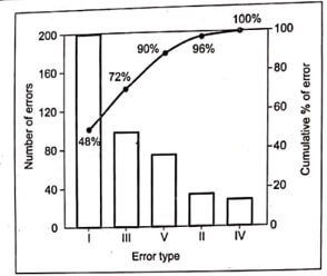
Example 1: Table 1 shows data collected from a given production process. The table shows that there are five possible error types and totally 2165 number of components are inspected of which 416 components (i.e., 19%) are defectives. Type I errors accounts for 47.7% and type III error accounts for 24.7% ; error types I and III account for about 72% of all errors.
The Pareto diagram is constructed as shown in Fig.1 on the basis of Table 1 by ranking the error types according to their failure percentage. So one need to concentrate more on reduction of error types I and III first.
Table .1. Distribution of errors on different error types
(Total number of components inspected = 2165 )
| Error type | Number of error | Failure percentage (%) | Relative failure percentage (%) |
| I | 198 | (198/2165 = )9.2 | (198/416 = )47.7 |
| II | 25 | 1.2 | 6.0 |
| III | 103 | 4.8 | 24.7 |
| IV | 18 | 0.8 | 4.3 |
| V | 72 | 3.3 | 17.3 |
| Total | 416 | 19.3 | 100.0 |

Fig. 1. Pareto diagram
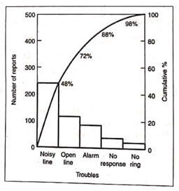
Example 2: Construct a Pareto diagram for reports of troubles with telephones.
Solution: A Pareto diagram for reports of troubles with telephones is represented, as shown in Fig.2.

Fig. 2. Pareto diagram for reports of troubles with telephones
Fig.2. shows that the noisy lines and open lines account for 72% of the telephone-trouble reports. So one need to concentrate more on these two troubles for further improvement.


